What’s the Goal?
Whether you’re creating images yourself, hiring a pro, or even selecting stock shots, there is one primary reason to invest any time or money at all in photography for your brand and that reason is: to drive sales.
The primary job of marketing is to modify the behavior of your ideal client (get them to click, share, buy)… and the most effective way to impact the actions of these people, is to hit them in the feels. To move them. To make them laugh, cry or just WANT SOMETHING really badly.
Photography (video and still) is hands-down your most effective tool to make an impact.
The goal, when choosing or creating imagery for your brand, is simple. You want images that will make your people FEEL SOMETHING. But how do you do that?
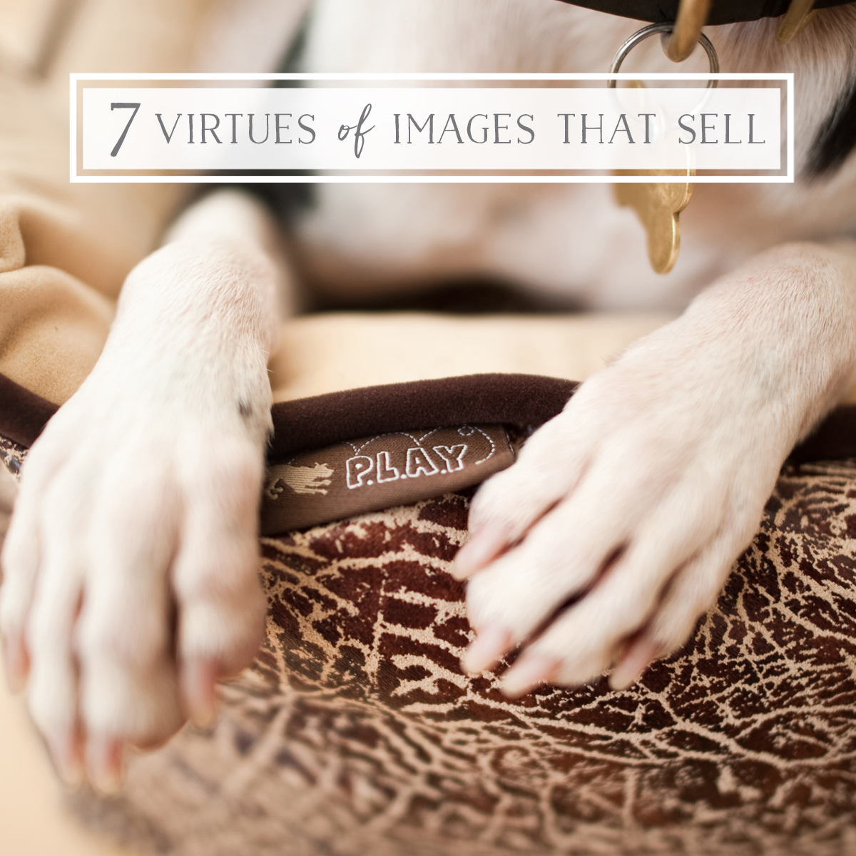
The 7 Virtues of Images that Sell
Essentially, to cut through all the visual, digital and marketing noise swirling around your customer and their pets, you must procure images that are authentic. Images that actually look and feel like real life, but the best possible version of it. Images that make promises about how this person’s life, or the life of their pet will be, if they buy your goods or services.
Images that say ‘hey, come on over and step into our universe where all of this goodness happens all day every day’.
To make this very lofty task more straight forward, we have created a formula to help you break it down. To create or choose images that sell, you simply need to check that they tick the boxes for each of the 7 Virtues below. Ok, I admit, I love acronyms. So, to make this whole thing easier to remember, I made a fancy acronym for you…
Boom. The ‘F.O.R R.E.A.L’ formula below will guide you to authentic images that move your customer and sell your shit. Plain and simple. Eventually, you or your brand’s image buyer will develop a strong internal filter for the right images (even the slightest nuances of what makes an image ‘the one’ ) but until then, you can use the acronym (and the printable checklist below). Let’s have a look…
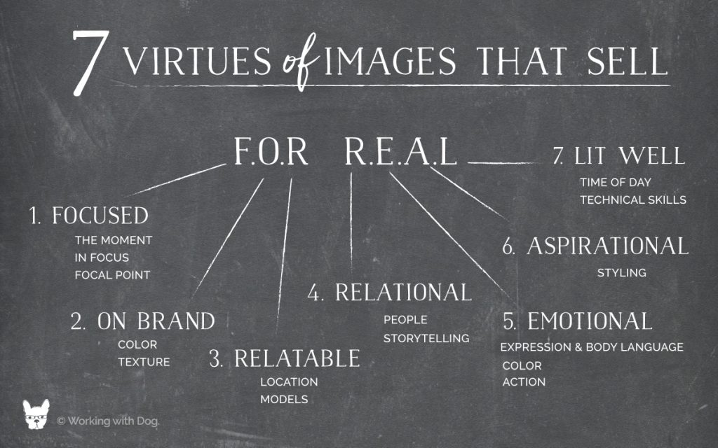
The 7 Virtues of Images that Sell are:
- Focused
- On Brand
- Relatable
- Relational
- Emotional
- Aspirational
- Lit Well
1. Focused
One of the most potentially obvious and misleading elements of images that sell, is that the focus is on the thing you sell. I say obvious, because, duh! I say misleading, because for most brands, the ‘thing you sell’ is not a THING – it’s a feeling, a lifestyle, a personality, an aesthetic, social revolution or similar intangible ‘goodness’ that the brand represents. The tangible stuff or services you sell, are simply the logical, transactional way that people can buy into this feeling or lifestyle. The trick is to not get so hyper focused on the tangible thing (which obviously does need good photos too) to neglect to document, share and glorify the intangible stuff. Both need imagery to ‘sell’ them – but only one will make or break your #milliondollardogbrand – can you guess which??
One way to solve this conundrum, is to photograph your product or service ‘in context’, in what we call ‘lifestyle imagery’ – photos where the product is present and visible (and looking great) but not the hero of the shot. The hero is the moment. The feeling. The relationship. The lifestyle.
Another important point when it comes to imagery that’s focused, is the clear technical element of having images that are both in-focus (another duh) but also clean and uncluttered enough that your eye gets drawn to where it’s supposed to go. If there is chaos (small details, background noise, messiness) it needs to be purposeful.

In Action:
Photographers: Use prime lenses or wide apertures. In 90% of the shots you take you’re going to want for the most buttery, blurry, un-busy background you can get. This allows room for text when the image is used online or in print.
Brands: When creating your vision for your photography (a shoot or when you’re shopping for stock) be sure to spend at least 50% of your energy, effort, budget or shoot-time on images that sell a feeling or lifestyle, instead of all descriptive product or people shots. Detail shots that evoke the senses, moments that tell your brands larger story, and textures that provide context to the positioning of your brand. These will end up being the MOST useful images you have when it comes to the home page of your website, use in social media and printed materials like look books & catalogues.
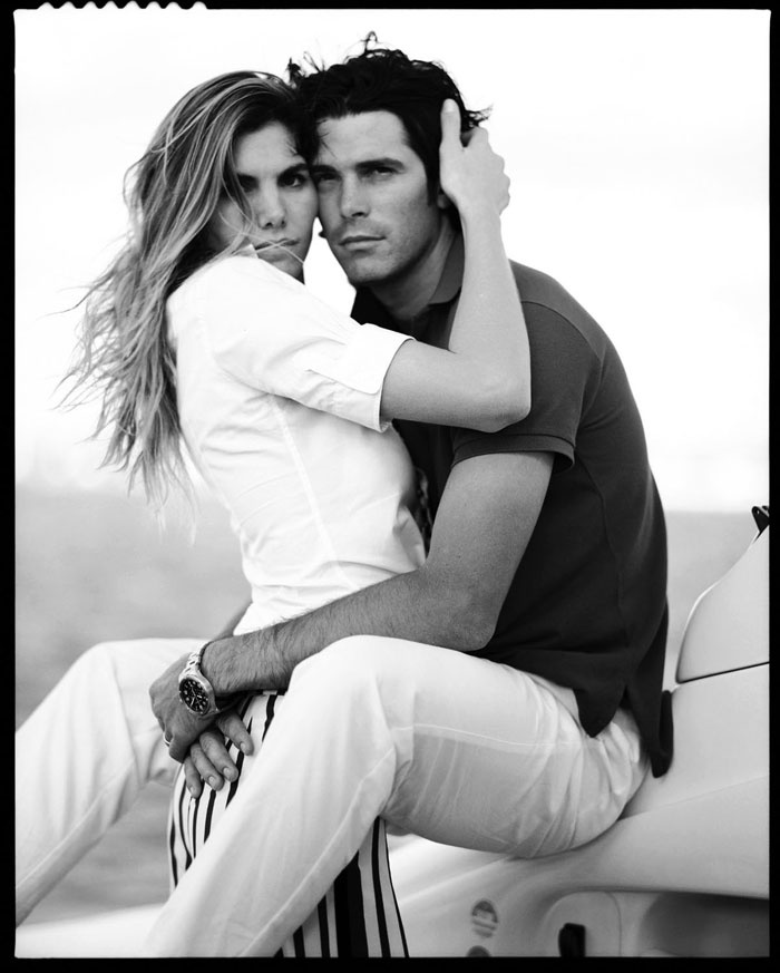
Non-Pet Example: Check out Ralph Lauren’s photography to see a world leader at the ‘selling a dream’ instead of a product skill.
“The marketing genius is that his brand conjures romantic, nostalgic visions of prairie women and rugged wranglers, and clean, Ivy League privilege, yet Lauren made his billions from expensive polo shirts and denim.” Read More >
2. On Brand
Ok, so as much as I can’t really stand the term ‘on brand’ – It really does have a place and a purpose! What it means for your photography to be ‘on brand’, is that it looks, feels and tastes like what your brand stands for. Don’t know what your brand stands for? That’s where you should start! You’ll want to ensure you have, at minimum, a consistent color palette for your brand, so that the images truly ‘fit’ within your marketing materials. Definitely get serious about pulling together some Brand Guidelines if you haven’t already. This will make it easier to communicate exactly what you want and get consistent results with your photographer and any other contractor you work with!
One of the most important and simple ways to ensure that your images are ‘on brand’ is through color. If you have little pops of your brand’s primary colors in the images, when they are used in your marketing materials, they will pull the whole message together.

Another easy way to ensure your images feel ‘on brand’ – is to get clear on some textures that make sense. Is your brand bright green grass and bright blue sky, or is that too shiny or clashy with your palette? Is your brand white marble and pink roses, or is that too fancy? Is your brand reclaimed wood and plaid, or is that too dark and moody? Should you be using candy colored paper backgrounds or real textures like wood or concrete? These are easy choices to make early, that lead to consistency and cohesion which definitely impact your clients’ experience in a positive way.
In Action:
Photographers: Be sure to get a ‘style guide’ or ‘brand guidelines’ document – or get photos of the products in advance of shooting. You will want to very carefully plan your locations, props, dog models and human wardrobe selections to match the color palette and general ‘feeling’ of the brand and products. Are they rustic? Are they super modern? Are they very bright and colorful or more earth toned? Are there themes that you can play up? (ex. beach, healthy, wintery & cozy, country) You may need to rent a location to shoot in if you don’t have anyone or anywhere in your network that ‘fits the bill’ – try a pet-friendly Airbnb – just be sure to tell them what you’re planning and get a property release!
Brands: Get clear on your brand. Know what you want before you hire a photographer. You are the architect of your brand, not the photographer. Equally, look around. Create a moodboard on Pinterest to start to try to define what imagery you like – adds tons of stuff you’re drawn to (that makes you feel something) then start eliminating stuff that doesn’t ‘fit’ your brand.
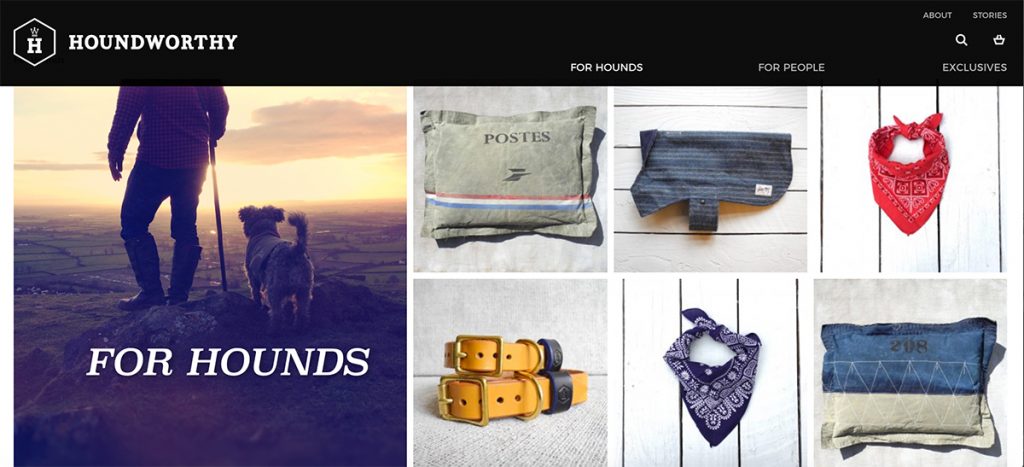
Pet Example: Check out Houndworthy for a brand that has absolutely nailed the ‘on brand’ imagery – from their lifestyle shots to their products. They have essentially built their brand around photography. It’s not highly produced either, it’s DIY (lots of their images are iPhone) but it just works.

3. Relatable
One of the major flaws with most stock images, is that they are so foreign to our human experience, that they don’t make us feel anything. They’re too perfect, too bland — too manufactured and our brain can see right through it.
For images to actually dig in and stir up feelings, they need to be compelling: instantly interpreted by our brain as real. They key to that, is to ensure they are relatable to, and evocative of our actual human experience.
To pull this off, the secret is to shoot with spaces, people and pets that your ideal audience can relate to but in a very aspirational way (see #6). The images need to appear ‘authentic’ and ‘real’ – which is harder than it sounds to fake!
In Action:
Photographers: Pay careful attention to your sets and locations. Wherever possible use real homes and real offices – places that have real knick-knacks (but not too many) and real life moving through them. Clean, tidy, designed well and perfectly paired to the brand, but real. I like to use real pets and their owners too – the connection that comes through in photographs defies explanation (see #5 relational)!
Brands: Work on defining and understanding the feeling and lifestyle we talked about in #1 and then reverse engineer the images backwards to match. Since this is hard to do well, the temptation is to get and use all user-generated imagery. Using photos submitted by customers can be effective and very valuable (especially as social proof) – but the quality is generally low, so don’t rely on it for big marketing pieces. Also consider working with influencers who can produce high-quality content that is is still super relatable.
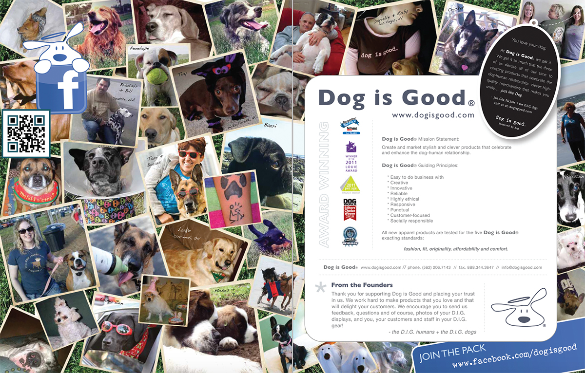
Pet Example: At Dog is Good we used user-generated stuff on Facebook and in the front spread of the our look book to reinforce just how important our customers were to us, and as a form of social proof (hey look how many real life people love our stuff in real life!) For the rest of the catalog we jumped into the very clean, super professional imagery – but featuring actual real customers – all shapes and sizes and ages – our tribe!

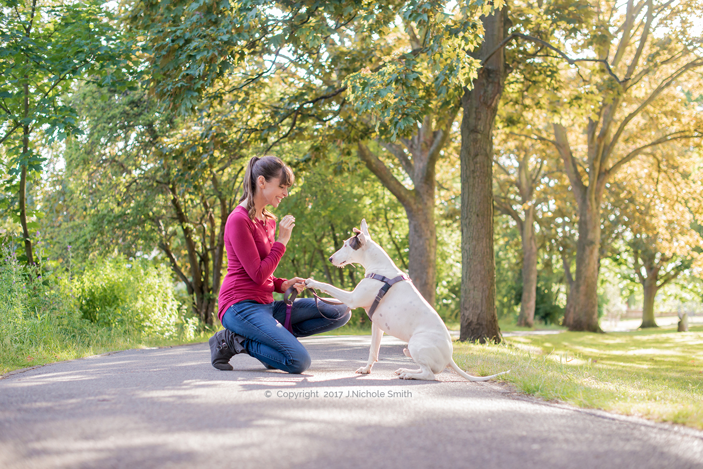
4. Relational
The imagery that will be the most effective in your pet brand marketing, will undoubtedly include humans. Even if it’s just the suggestions of people (hands, feet, blurred in the background) people are present in images that sell. This is the relationship aspect that nearly all pet brands aspire to glorify. Any photo with a dog in it is improved by some suggestion of a person there with them – this is what sparks our ability to connect with that moment – imagine us there with our dog.
The connection between pets and people aren’t the only relationships that appear in images that sell. Storytelling, letting the viewer connect the dots between the brand and the product and the moment disclosed in an image can be a super provocative approach. This slightly mysterious, slightly fashion-inspired technique builds curiosity and desire, sucking the consumer into a fantasy world, the way a good book would.
Of course the relationship between the pet and the product is critical as well. Does the dog look cozy in the bed, obsessed with the toy, relaxed in the life jacket, super keen to eat the food. We’ll dive in this a bit more in #5 Emotion (action).
In Action:
Photographers: Get good at photographing people. Not in a posey portrait way, but in a natural ‘interacting with dog’ way. Hard to convey the ‘dog human relationship’ which nearly all dog brands care about, with out the human part! Practice working with different shapes and sizes of people and learn a bit about posing so you know how to ‘pose’ a shot that looks unposed.
Brands: Be willing to take risks and expand outside of the literal. Get clear on the ‘why’ behind your brand so you know who your people are and can represent them accurately. How old are they? Who do they date? Do they have tattoos? Do they have big dogs or small ones? How do they dress? Where do they live? Once you introduce people into your images your risk of turning people off increases (which if you ask me is a good thing, because your risk of building mega-fans increases too) but you want to be making informed decisions about the way you represent the people in your imagery.
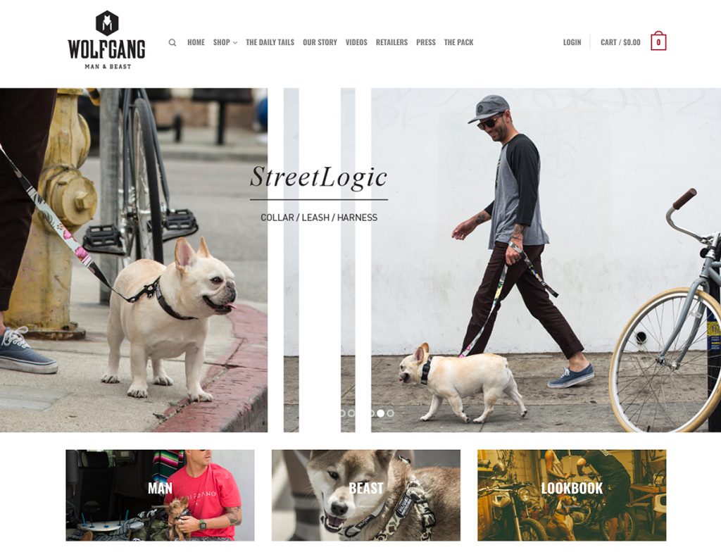
Pet Example: Check out Wolfgang Man & Beast – a gritty, skate-inspired dog brand for grown ass men. Have a look at how they use people in their photography – they look effortlessly ‘on brand’ while also looking real – giving the product a really visceral ‘real life’ context. This is super opposite from most of the glossy, colorful, feminine, middle-class stuff we see in most pet industry marketing.
5. Emotional
This is the most important element of all. The whole point of all of this is to spark emotion.
In order for an image to drive purchase, your ideal buyer needs to FEEL something when they see it.
Sounds simple enough, right? Well, it’s not. If you’re obsessing over making the product front-and-center you can easily zap the realness and energy right out of the image.
In addition to the other virtues listed here, your formula for emotional imagery will include:
- Expression & Body Language
- Color
- Action
Expression & Body Language
The importance of the expression and body language of the pets and people in your images cannot be overstated. The thing about dog owners, is that our brains know the difference between a happy tongue-out pup, and a stressed-out panting one. We know that yawning is not cute, it’s a stress signal. We know that wide crazy eyes or wall-eye (seeing the white in the side of a dogs’ eye) means they’re not entirely comfortable, relaxed or sure. We know that ears back means wary or nervous. You cannot fool the dog owner. This means as a producer or selector of images you NEED to be as savvy as the average dog owner when it comes to picking the moments that have the most happy in them.
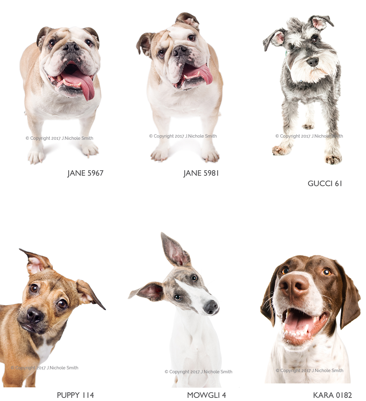
Expression and body language is probably the #1 element of pet brand imagery that will drive emotion… make sure your images are creating the emotions you want to be representing!
Take the example below, on the left, an image from Deposit Photos – on the right an image I took. The pet food company came to be because they had scoured Shutterstock, iStock and other sites to find an image that felt right… here was there comment when they first got in touch:
“What we love about the image is the dogs tilt of the head interacting with the audience.”
They ended up licensing this image from me for a lot more than they’d pay on istock (even though this other Boston has a decent expression) because of the combination of image quality (the lighting, see #7) and the body language: ‘head tilt’.

Color
As previously mentioned, another quick indicator of emotion is color. Don’t think so? Spend some time looking at Pinterest, Lifestyle Magazines, Instagram or Cookbooks and take note of the strong use of color – weather it’s bright and rich, or sparing and fresh… color plays a huge role in telling our brains how we should feel. Color is a VERY easy way to force people to feel a particular way, so make sure you’re wielding this tool purposefully!
Action
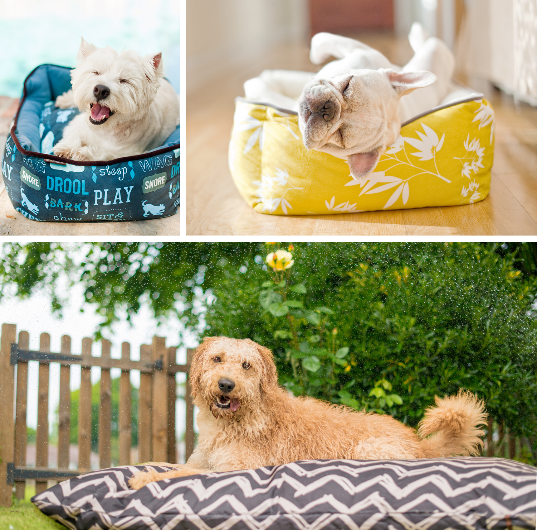
One of the keys to evoking emotion, as briefly mentioned in regards to being Relatable (#3) is movement within the image. The perfectly posed stuff simply doesn’t move us the way the moment before or after that perfect pose does… Check out the dog beds above – if the dogs all looked like they’d been put in a perfect ‘sit, down, stay’ on the bed then these images wouldn’t be as compelling. However the combination of natural movement and the feeling that action is about to happen or just has happened, tells your brain that this dog really chose to go sit on that bed and is staying there because it’s comfy, not because a photographer is telling him to. This fine-line between ‘too perfect’ and ’emotive’ may take you a while to see/understand – just remember perfectly posed like in a portrait is not it! Part of what makes the action or dynamic moment so critical is that it gives away the dogs’ emotion – which you’re hoping is convincing the viewer just how happy he is to be interacting with the person or product.
In Action:
Photographers: One of the steepest learning curves when switching from portrait work to commercial work is the more ‘controlled photo documentary’ style required. You need everything to look 100% natural but be basically 100% under your control. This means you need to master the art of posing, then waiting for ‘life to happen’ to grab the real moment before and after the perfect pose. Practice seeing in the frame if the pet, person and product are all still looking flawless, then add some stimuli to the moment to create genuine moments of bliss where the pet is interacting with the people or product. Having an assistant makes this much easier (so you can reset the scene quickly if you need a couple tries). Don’t settle for the posed – but also know if you haven’t quite nailed it – so you can try again (and you don’t get the proofs back and see the perfect shot is out of focus or has the dogs’ foot cut off).
Brands: When selecting images, make sure you’re taking into account how they make you feel – not just how perfect the product looks. The images you pick for those big trade show banners and hero images on the website should be 100% about the happy dog moment in which your product happens to also be featured (see #1). Work with your photographer to shape a vision of what feeling you’re going for and how you imagine that feeling being exemplified. They can’t read your mind. Be sure that the photographer you choose actually shoots the type of images you’re dreaming of!
Pet Example: Check out

6. Aspirational
Perhaps one of the trickiest virtues of all to master is the aspirational nature of your images. This is the secret sauce between looking ‘too perfect’ and looking just perfect enough to be super duper desirable.
Of course in all marketing, there is a delicate balance to be struck between wanting to put your best foot forward, and also wanting to stay authentic and real (see #3). In almost all cases, what you see in the final product, is not what is REALLY happening behind the scenes (have you seen those behind-the-scenes with food photos for commercials? CRAZY how un-edible that Big Mac or that cereal is when it’s photographed to look delicious!)
There is almost always chaos, tape and glue behind the scenes… Especially where dogs are concerned!

However when it comes to your photography, you want to present your best possible face. You have only an instant to grab someone’s attention and make them crave the product or feeling you’re selling – so don’t be shy about dreaming big.
While photographers are not miracle workers, there is a LOT that can be done with photoshop to make your decent images amazing: removing leashes, adding extra negative space, adding + removing props – these are all in the realm of possibility. Of course, better to sort these things while shooting… but when you’re shooting for the right expression (like with the book cover below) sometimes you’re not ready for it when it comes (I had to add the bowl later).
The difference between aspirational and ‘too perfect’ as discussed in #3, is typically down to expert styling (check out all the stuff in the background of the dog in the kitchen – each item was placed there on purpose for color, height or shape)
Either you’re great at this, or you hire someone to help you. Sometimes your photographer will be great at this, sometimes you need a third party person who is the visual merchandising genius – but this is like the icing on the sellable image cake.
Think about all the brands you truly love. What are their images like? What lifestyle or feeling are they pushing? How do they make you want it?

In Action:
Photographers: Styling. Styling. Styling. If you’re not a natural visual merchandiser, scene builder, interior designer type, then you definitely need to pair up with someone who is. They are called stylists, and it is their job to prepare the scene so it looks aspirational. Perfect but lived in, characterful but clean.
Brands: Have aspirations!! If you’re building a brand and not just a business, than you should have aspirations of grandeur! You’re a #milliondollardogbrand – what does that look like? Creating an oasis of delicious ideals in a sea of disappointing reality is the job of the brands we love who makes us feel like everything is coming up roses in their universe – whether that’s in their instagram feed or in a physical shop. Challenge yourself to raise the bar on your visual aesthetics and imagination of what your ideal client aspires to. Help show them that vision and associate it with you, your product, services and brand. This is where having a designer, a strong aesthetic visionary or a super clear model to follow can be super helpful (it’s ok to get help!!)
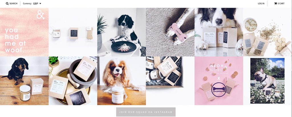
Pet Example: Check out Neoh and Nobo – boutique biscuit brand. Their images are not technical perfection but it works for them. There is a consistent aspirational tone to their photos (lots of wood, marble, flowers empty spaces and of course, biscuits) that stands out and really works with their brand. It’s a premium feel that is kept relatable by the minimal kraft packaging and white labels.
7. Lit Well
This one I feel goes without saying, but sadly is one of the most obvious indicators of amateur stuff. There are SO many reason bad lighting is bad (like in the example above, it simply turns you off buying the product!) But whether your brand requires glossy studio lighting, or ethereal natural light, making sure it’s purposeful and appealing is most of what makes an image emotionally impactful. Sunshine especially has a powerful impact (happy / summer) as does the lack of it (moody / winter) so make sure that the light in your images is telling the right story. If you’re going with studio stuff, make sure you or your photographer has a solid grasp on the equipment and that the images you produce aren’t going to be harsh, brassy or yellow – and the backdrops aren’t going to be dirty, dingy or obvious.
If you’re going with lifestyle, it’s very likely you’ll want to stay out of direct sun unless it’s lighting your subject up from behind. Shade provides a much more appealing, even look.

If you’re shooting inside, understand the limitations of your location. If it’s lowly-lit by flourescent lights, the images are going to be green. If it’s quite dark, and there is a lot of action, the photographer will need to bring auxiliary lighting and that is going to impact the look of your shots.
If you’re choosing stock images, pay attention to the light in the image – does it make you feel warm and happy?
In Action:
Photographers: You don’t have to do studio work, you don’t have to do on-location work, you don’t have to have a full mastery of off-camera flash. What you DO need to do is figure out where you’re most suited to produce consistent, high-quality results and stick to it. As your personal style evolves, this will become more and more clear. Be honest with your clients and don’t try to be all things to all people. Equally, practice in low-light conditions, and keep pushing your technical skills with personal work so you can feel more comfortable and confident when shooting commercially.
Brands: Listen to your photographer about location, weather and time of day. These conditions have a surprisingly significant impact on the quality of your final images. Chances are you’re never going to be shooting mid-day outside – no matter how convenient it is for your models. Harsh overhead light just does not create dreamy images. If it’s hot, you’ll also have panting dogs – which is not a look you want in all your photos! You may need to get up early or stay up late to get the shots you want.

Non-Pet Example: Considering he’s a chef, Jamie Oliver has one of the strongest personal brand visual identities I’ve seen. From his cook books to TV shows to restaurants – there is extreme consistency in the feeling of his brand – and a LOT of that comes down to fresh, natural lighting.
Challenge
I suggest you download the printable so you can keep these insights on hand and USE THEM next time you’re choosing or creating images. Then, I double-dog-dare you to upload one of your lifestyle photos to the Facebook Group and ask for critique (are you brave enough to seek honest advice?) I know it’s scary to put yourself out there – but one of the most valuable things about being in this group is using the experience and expertise of its members!


